Cres Creations
Project Overview
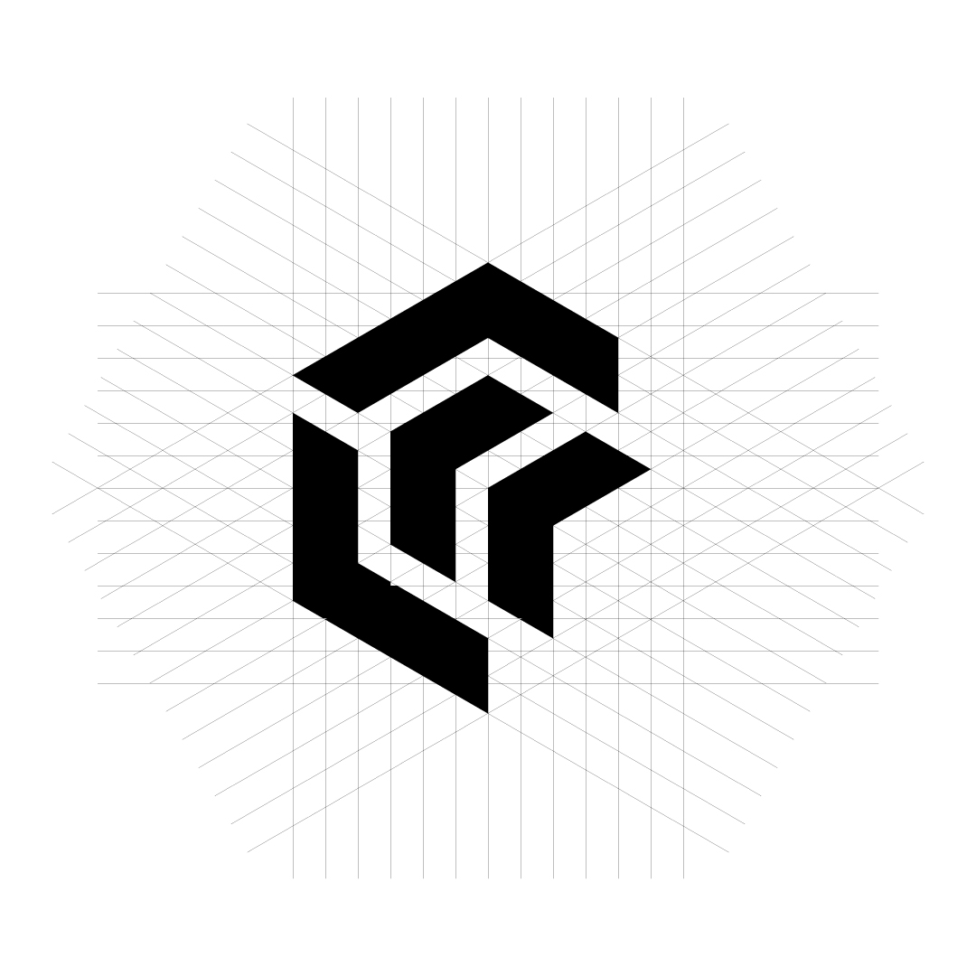
Logo Concept — CRES CREATIONS
This logo is built around structure, growth, and creative depth. The mark is formed from a geometric monogram that subtly merges the letter “C”—representing CRES / Creations—into a three-dimensional, cube-like form. This reflects the brand’s multidimensional approach to creativity: design, strategy, and innovation working as one.
The angular construction symbolizes precision, consistency, and professionalism, while the inward movement of the shapes suggests creation from within—ideas being carefully crafted, refined, and transformed into meaningful outcomes. The use of strong, bold lines communicates confidence and reliability, positioning CRES CREATIONS as a brand that builds solid visual identities, not just visuals.
The underlying grid system reinforces intentional design, balance, and scalability. It shows that every creative decision is guided by structure, not randomness—making the brand suitable for growth across digital, print, and global platforms.
Overall, the logo represents creative architecture:
a brand that doesn’t just design, but constructs ideas with purpose, clarity, and long-term vision.
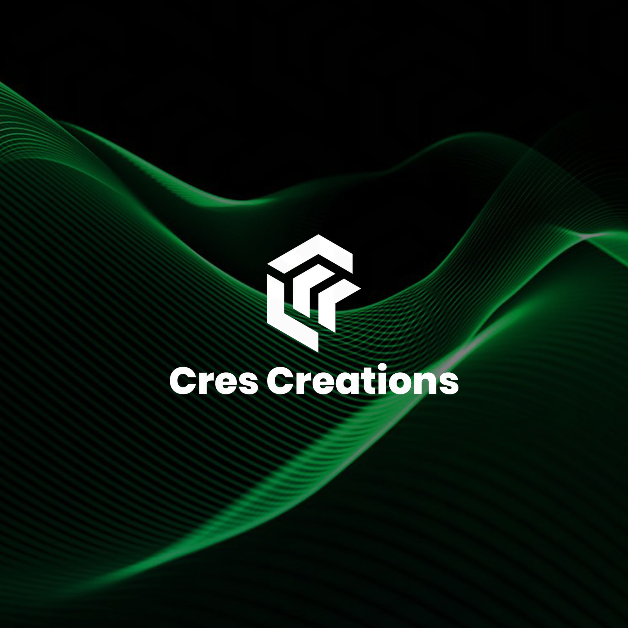
Project Gallery